Saturday 26 December 2009

chosen picture for postcards

I have created four postcards, all from Francis Picabia's collection, I chose to use his Udnie, Dances at the Spring, Edtaonisl and New York. All these artworks complimented each other and have made a little collection of postcards on their own.

I created the leaflet in In Design, annd tried to use a similar colour pallet to my poster so everything would tie in. When I printed it it was fairly straight forward, I printed one side and once I had worked out what way to put it back through again to print on the back, it all worked out. Below is one of my posters front and back.

essay booklet

My essay booklet, I first wrote it out in text edit and made any corrections in there. I next created 4 x templates in In Design, I needed four documents even though I was only using two pieces of paper because there were four sides. I had created a paper version mock up first and page numbered it, so I could see where and which order the pages went in. Now I just need to place my text in the allocated spot and flow it across to all the other pages. With the blank pages I placed some Dada artwork to make it more interesting. I had a little trouble when it came to printing it out as it keept coming put upside down, but I soon got to grips with it.

leaflet

I began by setting out my Leaflet template in In Design, I downloaded a template of the Adobe website, I chose an A4 template. Before I started to design it in In Design I looked at various random leaflets to see how they were folded, set out and the general overall functionality of them. I first made a paper version, so I knew how I was going to fold it and where each page was going to go. This would not only help me when coming to do it in In Design but it also would help me to visualize what I was going to put on each side. Printing would be a challenge and a bit of trial and error as I would have the same piece of paper through the printer twice, so it printed on both sides.

I started with the front of my leaflet, introducing the subject of the leaflet with some illustration. I needed to choose a colour for the background of the leaflet, my first choice was to pick a shade of blue, as this would compliment the Dada artwork, as blue is a commonly used colour. I was not sure which colour to have my writing in, however I left it in black to begin with just to see how I got along with it. As I started to develop the front etc, I brought in a couple of other colours, pink, yellow and a darker blue, I decided to bring these colours in as I have used similar ones in my poster and thought it would all tie in together if I did so.

I decided that I was going to include a time line of the Dada events, and lay it out across two pages, I was not sure to keep it solely to just text of to include some pictures to illustrate. I would also like to elaborate on some key dates from the time line that were important during the Dada movement. Also I am going to include a brief introduction about the history/origins of the Dada movement. Below is both sides of my finished leaflet.


Poster

My Poster must convey the style that I have chosen to interpret, this to include colours, style, type, composition etc. In order to create this I have chosen to use Francis Picabia as my inspiration, in order to achieve this I have chosen one of his famous paintings called Udnie, which he produced in 1913. I really like the selection of colours that have been used they are all cool colours, greys, blues, whites and greens. The crowded space of curved lines and shapes create a sense of depth with in the paintings. Trying to interpret this in my own way, I will find to be a challenge but very fulfilling, I will use a similar colour palet and use a variety of lines and shapes, along with gradients to create the variation in each colour.


When creating this poster I found that Picabia uses lots of layers, he lays shape upon shape on top of each other. I found this to be a challenge as the layered shapes are some how all linked in some way. Also the colours he has used are not all solid colours, I found this to be very hard to recreate on the computer. I create a colour pallet that used similar colours, I created a swatch to enable to me to reuse the same colours.

I started by doing lots of random shapes as a background, then began to layer, I have tried to recreate one similar to his Udnie, but of my own creation. It took me many attempts and reworking in order to create the atmosphere that Picabia manages to create in his art work. In the Udnie, the centre is rather full and got lots going on, however less so in the outskirts. Below is my first attempt: I did not finish it as I was just not feeling it, thought it lacked the crowded centre and some of the shapes were to big, so from the experience that I had from doing this one I started to recreate another version, this time aiming to make it more crowded in the middle.


After I had created the above, I tried again, this time I wanted to be more random with my positioning of my objects, but all so wanted to achieve some flow, like picabia's Udnie, I also looked at some of his other art works that were of a similar configuration to the Udnie, for example his 'Dances at the spring' (1912), 'Procession in Saville' (1912), 'New York' (1913) and mostly ' Edtanist' (1913).

I concentrated on the shapes that he uses and how he has put them together, I found this to be quite a challenge because it was hard to make it work without making it look to orderly. Below is my second version. I have changed the text and its colour on the right poster, as I was not too sure on my first choice of text.


I did some type research, I found out that Dadaists thrived in making their type style unconventional, they did this by frequently mixing different fonts, using unorthodox punctuation, printing both horizontally and vertically, also they used many random text symbols on the text. A French Avant Guard poet described the Dada revolution with graphic design as 'each page must explode, either by deep and weight seriousness - the whirlwind, the vertigo, the new, the eternal - by the cursing joke, by the enthusiasm for the principles, or by the manner of being printed'. This is truse of the typographic style as it broke many traditions and there were many interpretations of this unconventional Dada typography, below are a couple of examples. I began looking for a font that would be of the Dada style, I found on on Defont website called DaDa Antiquerist, I thought that this was of similar style because of the unconventional way that the letters do not line up straight.


Chosen typefaces and colour swatches

These are my chosen colours for my poster and I will be using similar one through out my project. I sampled these colours from Francis Picabia's Udnie piece of artwork.

Cardborad box

I got ideas of how the net of my box would look like on the internet, there were many to choose from, but the one I have drawn below is what I decided to recreate. This template of a box was only the bottom and did not include a lid, so to create a lid I did exactly the same template but made it less deep and slightly wider so it would fit over the bottom. To make sure that this would work I first made the box in wallpaper which was rather flimsy but gave me a good idea of how and if it was going to work. I made sure that the length of my box would accommodate my poster once it was rolled up. I then made it for real, I chose blue card to make it in and did not glue all sides to begin with, I just paper clipped the sides so I was definite that this was going to work.


Sunday 20 December 2009

dada

Dadaism is a cultural movement, it began in Switzerland during World War I. This movement involved mainly visual arts, literature, poetry, art manifestos, art theory, theatre and graphic design. However it also delved into anti war politics, by using anti war cultural works, other activities that Dada got involved in were many demonstrations and public gatherings. This movement was a major influence to later styles for example the Avant - garde, surrealism, and pop art.

Dadaism is the main movement that layed a strong foundation for the surrealist movement. Below is a piece of work by a artist called Francis Picabia and this particular piece of his work is called Udnie.


Hear are some other works of art from the Dada movement, the one below has names of artists that were involved in that movement.


Tuesday 8 December 2009

My chosen Movement

After researching a few movements that interested me the most, I decided to do Dadaism possibly combined with Surrealism. I found these movements very interesting and thought provoking, the artists that I found to be essential in these movements were Salvador Dali and Rene Magritte work for surrealism as these were the two most prominent artists in this movement. However I found that both of these movements crossed, Dadaism was also very interesting to me, a particular artist caught my eye was Francis Picabia.

Francis Picabia, he had a successful career as an impressionist painter as well as being a part of the surrealist group. By 1912 he was a member of the Dada group, he influenced and encouraged Dadaist tendencies. Through out his career he had a vast array of styles as can be seen in his Spanish Night painting (1922) and The Happiness of Blindness (1947).

In this project I would like to mainly focus on Francis Picabia, however I would also like to incorporate some of the surrealist style into my project. I will combine both of these movements as the converge into each other, but my main influence will be Francis Picabia.

Monday 7 December 2009

Egyptian Revival

Egyptian Revival is another movement that was particularly interested in researching. This movement consists of borrowing the most spectacular elements, decorative elements are then given new life through new uses. The idea of this movement was not to copy what had already been previously done by the Egyptians but was to re create, or to give them an appearance of renewed vitality, a function other than the purpose for which they were originally intended. The Egyptian revival was an popular architectural style in Europe and the United States during the 19th century. It is generally dated by napoleon's conquest of Egypt and, in Britain, to Admiral Nelson's defeat of Napoleon at the Battle of the Nile in 1798. Below are a few examples of Egyptian Revival.


Surrealism

Surrealism is a movement that is dedicated to imagination as revealed in dreams, free from conscious control of reason and convention.The work of a surrealist usually contained realist imagery arranged in a nonsensical style in order to create a almost dream like image.

This movement was founded in 1924 by Andre Breton with his Manifesto of surrealism, the movements principal aim was 'to resolve the previously contradictory conditions of dream and reality into an absolute reality'. The major artist of this movement were Salvador Dali, Max Ernst, Rene Margritte and Joan Miro. The impact of this movement can still been seen today, it is a popular choice by many advertisers.

Surrealism can be divided into two parts, Automatism and Vertisic Surrealiam. The first automatism focused on expressing subconscious ideas, they divided their imagery purely for spontaneous thought. The second Veristic surrealism, this artists aimed to to represent the connection between abstract and real material, in other words they transformed objects from the real world into their paintings.

One world renown surrealist artist was Salvador Dali, he was a Spanish Catalan surrealist painter born in Figueres. He was known for his rather bizarre surrealist work, one of his best known pieces of work is " The persistence of memory "


This piece from his collection consists of landscape forms that slowly change from one object to another. There are lots of spaces and the contours of the shapes are very interesting, however the image as a whole remains unified.

Another surrealist artist that caught my attention was Rene Magritte, he was a Belgian surrealist, over the years he has produced many thought provoking images. I found that with many of his images, he liked to use blue sky and clouds, below are a couple of examples.


Tuesday 24 November 2009

Design Time Capsule - Research

Art Nouveau

Art Nouveau (new art) is an International Movement, not a style. It reached its height at the end of the 19th Century, it became popular due to its style of Art, Architecture, Applied Art and the Decorative Arts. In 1900 World's Fair in Paris is where Art Nouveau was established as the first new decorative style of the twentieth century. This movement very soon became a part of everyday life, with different styles being used for Furniture and Architecture. This movements popularity grew due to the help of a Czech artist Alphonse Mucha most known for his images of women, he influenced and helped to direct the way this movement was going to uptake. Much of his work he produced for example paintings, posters, advertisements and book illustrations, as well as jewellery, carpets, theatre sets and wallpaper was all initially called the Mucha Style but later became to be known as Art Nouveau. Below are two pieces from his collection.


A very interesting designer was Louis Comfort Tiffany, an American designer he trained as a painter in the 1860s with the artist Samuel Coleman. Tiffany had close ties with European Art Nouveau; he made a series of windows, glassware and lamps all ending up appearing at the Paris gallery of Siegfried Bing. In 1902 he became design director of the family silver firm Tiffany & co. Show his glassware

William Morris (1834–1896) was the single most influential designer of the nineteenth century; he was a designer, writer and socialist. Trained as an architect, Morris mixed in Pre – Raphaelite circles before founding his own firm in 1861, which became Morris and Co in 1875. Through his ideas on utility and beauty in design, coupled with his socialist principles, he became the defining figure of the Art and Crafts Movement. He drew on medieval motifs and designed furniture, stained glass, wallpaper and fabrics. His use of stylized floral and organic forms in his patterns was influential in the evolution of Art Nouveau. Show William Morris pictures

The Pre - Raphaelite Brotherhood was made up of a group of English painters, poets and critics, founded in 1984 by William Holman Hunt, John Everett Millais and Dante Gabriel Rossetti. The three founders were soon joined by William Michael Rossetti, James Collinson, Frederic George Stephens and Thomas Woolner to form the seventh member "brotherhood". The grouped formed with the intention to reform art by rejecting what they considered to be mechanistic, the brother hood had high regard for classicism they believe that it poses elegant compositions. The Brother hood objected the influence of Sir Joshua Reynolds, the founder of the English Royal Academy of Arts, they called him "Sir Sloshua", believing that his broad technique was a sloppy and formulaic form of academic Mannerism. In contrast, they wanted to return to the abundant detail, intense colours, and complex compositions of the cultural and artistic events of 15th century Italy are collectively referred to as the Quattrocento. Quattrocento encompasses the artistic styles of the late Middle ages (most notably International Gothic) and the early Renaissance.

The Pre-Raphaelites have been considered the first avant-garde movement in art, though they have also been denied that status, because they continued to accept both the concepts of history painting and of mimesis, or imitation of nature, as central to the purpose of art. However, the Pre-Raphaelites undoubtedly defined themselves as a reform-movement, created a distinct name for their form of art, and published a periodical, The Germ, to promote their ideas. Their debates were recorded in the Pre-Raphaelite Journal.
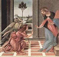
Sandro Botticelli's Annunciation, painted from 1489-1490, is an example Quattrocento art.

William Holman Hunt, one of the founders of The Pre-Raphaelites work was not initially successful, and was widely attacked in the art press for their alleged clumsiness and ugliness. He achieved some early note for his intensely naturalistic scenes of modern rural and urban life, such as The Hireling Shepherd and The Awakening Conscience. However, it was with his religious paintings that he became famous, initially The Light of the World (1851-1853, now in the chapel at Keble College, Oxford; a later version (1900) toured the world and now has its home in St Paul's Cathedral. In the mid 1850s Hunt travelled to the Holy Land in search of accurate topographical and ethnographical material for further religious works, and to “use my powers to make more tangible Jesus Christ’s history and teaching”; there he painted The Scapegoat, The Finding of the Saviour in the Temple and The Shadow of Death, along with many landscapes of the region. Hunt also painted many works based on poems, such as Isabella and Lady of Shalott. For Hunt it was the duty of the artist to reveal the correspondence between sign and fact. Out of all the members of the Pre-Raphaelite Brotherhood Hunt remained most true to their ideals throughout his career. He eventually had to give up painting because failing eyesight meant that he could not get the level of quality that he wanted. His last major work, The Lady of Shalott, was completed with the help of an assistant (Edward Robert Hughes). Below are The Scapegoat, The Hireling Shepherd and The Light of the World.


Friday 20 November 2009

Priceing

I looked at various cereal's and their prices, they all seemed to range between £1.20 and £3.oo, the ones at the top end of the scale are Alpen and cereal's that include more ingredients for example dried fruit. Most of the children's cereal's fall on the £1.90 price bracket. I have decided that if I was going to compete with these cereal's mine would need to be of a similar price. I decided that I wanted to price mine at £1.90, so it is able to compete with the rest of the children's market.

Thursday 19 November 2009

My Final cereal packaging

After many drafts and re positioning of objects, letters etc, I came to my final design. I came across some problems on the way to this final design. In particular I had a problem putting my design into 3D in the extrude and bevel selection, to begin with it was taking a very very long time to do one side. Then once it had done this, the next sides were just not mapping onto my 3D object at all, perhaps this was to do with the 3d effects and gradients that I used however I have not used that many. I tried to create this 3D effect on three different computers to see if that would help but I had the same problem on each. So because this did not work I had to produce it by eye, I created and 3D box and hand skewed my sides to fit the box, I found this very hard indeed, the perspective was hard to create to make it looked realistic. I managed to do some of my images and text, but this I feel compromised on the quality of my objects. Below is my design flat plan before I tried to map it, before I mapped it I separated the sides so I could save each side as a symbol and save them in their own library.


After reevaluating my design several times, there were a few things that I changed, the changes are shown in the screen shot above, firstly my masthead, to begin with it was just flat text, it did not really stand out from the page so I used the extrude and bevel option and changed its perspective, this worked really well it gave it depth and a almost life like feel. Also I put a gradient on my cereal bowel to make it more interesting, one technique that I found to be very useful was the drop shadow option, I used this on my character to make him come alive and look more realistic as before I did this he was very flat. Below is my hand made 3d representation.


Sunday 15 November 2009

Layout and what I was going to include on all sides

Once I had chosen a colour scheme, I was now ready to start on the content of my cereal packaging, for example designing the cereal itself, puzzles and activities for the children/my target group to play with, the ingredients that I had already touched on briefly, logos etc. This all now needed to be put together and positioned on my box.

I had already made the decision that I was going to have alphabet shaped cereal, there was just the question how do I create this so it looks like the texture and colour, that it would look like if true to form. So to create this real effect I first typed my letter how you would do any way, then I went to Type - Create outlines, this created outlines around the letter. Next I selected a cereal colour and went to Object - Path - Add Anchor Points, this added points around the letter so then the letter can be manipulated. To create an effect of an uneven outline I used the Effects selection and went to Distort and Pucker and adjusted it according. For this effect to take place I then went to Object - Expand Appearance. Next I used the pen tool to draw a shape on the side of the letter, and coloured this with a gradient, I arranged it and brought it to the front. Selecting all I went to Object - Clipping mask and Make and then shift A to give the rest of my letter a colour. This completed my cereal coloured letter however the letter was to smooth and did not really take the full effect that I was looking for. So I by using the ellipse tool I made almost crater like dents in my letters, this made the surface of the letter look uneven, I went through the same steps as I did to create the letter to create theses ellipses.


This effect is very effective way of creating this look, Once I had made all my letters, I wanted them positioned coming out of the bowl as it my character had created a spell on the bowl and the cereal was flying out of the bowl. So I positioned some in the bowl and some coming out on the air.


I wanted to include a word search on the back of my cereal box as it ties in with my spelling/word concept, I included words that were linked with magic as I have played on the word 'Speller' as it means to spell and spell as in magic spell. I included 11 words and written than below the word search so the children can see them written to help them find the words. I included another spelling/word game as most children's cereal's had more than one activity, so I positioned it on one of the sides. It is a very simple small one and it is jumbled up letters, that you have to make words from.


The nutritional information and ingredients, needed to be looked into in a bit more depth, so that I could make it as realistic as possible, even though I wasn't actually making the cereal. I looked at other cereals that were already on the market, however I found it difficult to find any children's cereal's that were a healthier option, so I looked at some of the adult cereals and used their ingredients to help create mine. I looked at their fat and sugar content, one cereal I looked at in particular was cheerios, theses have low fat and help towards maintaining a healthy heart. I want my cereal to be a healthier cereal for children however I also want it to help to be educational.

Monday 9 November 2009

Colour's

Colour is an extremely important issue when designing, the colour's must all compliment each other and in this case they must be suitable for both male and female. Colour's such as yellow, green. purple and blue are colour's that I will be considering when it comes to my cereal box. Below are a few examples of colour experiments that I tried, however none of which I decided to use.


I was not happy with any of theses colours, the blue I felt was already used by quite alot by cereal companies anyway, the green made it look more like animal food or some sort or gardening supplement and the purple was aimed more at the female market. I need to think of something unusual so that it would stand out against the other cereals. So below is what I decided on. I decided to have the yellow stripes as I have not seen many if any like this before, and the yellow is a very unisex colour, it is bright, cheerful and eye catching.


Healthy or not?

There are many issues that flood the children's cereal industry, the main one being how unhealthy the majority cereal's are. This issue is one that interested me greatly as I feel that the 'most important meal of the day' should be healthy. Many cereal companies choose to go for the unhealthy option as this in their minds sells better and is what children want, sweet, sugary breakfast, most children have extreme pester power when it comes to what they want and some parents give in, this is how the unhealthy options do so well. Many parents are unaware how unhealthy some cereals are as this is unclear on the packaging.

One cereal in particular that is the biggest culprit is Frosties, one article in the daily mail headlined an article "Breakfast cereals with more sugar than a doughnuts". within this article they named and shamed the worst offenders when it came to sugar content, heading the top of the list was Kellogg's Frosties with a massive 11.1g of sugar per 30g bowl, this is nearly 3g more than an average sized doughnut, next was Nestle's Cookie Crisp, with a staggering 10.59g, then again Nestle's Honey Cheerio's with a 10.53g, Nesle's Nesquik 10.5, Sugar Puffs 10.5, Kellogg's Coco Pops 10.2 and Kellogg's Honey Loops 10.2. All these cereal's had more sugar then a doughnut in just a 30g serving. I find this unbelievable these seemingly healthy foods are again one of the many contributes fueling our 'obesity crisis' and are aiming these terribly unhealthy foods at our younger generation. TV advertisements are one of the most predominant ways in which these companies market their product, showing them between children programmes so that they get the widest coverage possible, going straight out to the children.

I have decided that I want to make a healthy, educational cereal, one that is low in sugar and no saturated fat that tastes great! A cereal with natural flavors from toasted whole grains, and few if any added ingredients and flavors. My cereal will be a toasted whole grain cereal and should have no more than 81 calories per serving, max 2g sugar, Dietary fiber, Protein, Vitamins, B2, B6, B12, Magnesium, Vitamin C etc, Oats, and no hydrogenated oils or preservatives. Although I don't have to make the cereal this is what I am aiming for and is what I want the end result to be if it was going to be produced on a large scale.

Cheerios is my inspiration and its ingredients and health benefits is how I wish for mine to be. I want Oats to be be my main ingredient hence the name of my cereal 'Speller Oaties', I have taken this extract from the Cheerios website, it explain how Oats work and their health benefits, "Oats contain soluble fiber that can help soak up some cholesterol. Too much cholesterol can build up in your arteries and put you at risk for heart disease. Think of oats as tiny sponges that can help soak up some cholesterol and naturally remove it from your body. The soluble fiber in oats binds some of the cholesterol in your digestive tract. This cholesterol is "trapped" and some of it is removed from your body naturally. Oats contain more soluble fiber than whole wheat, rice or corn. In addition to soluble fiber, oats contain vitamins, minerals and unique antioxidants, which help make oats healthy.Cheerios® Cereal is Naturally Powered by Oats. From the first delicious spoonful, the power of nature is working for you. Every "O" is made with 100% natural whole grain oats and no other grain is better at lowering cholesterol. So go ahead, enjoy with a happy heart".


My Character

I now need my character, my mascot, this character will need to have personality , be cute and the children must love him/her. The character needs to help sell my cereal, I have thought of doing many different animals, to include Giraffes, Elephants, Lions, Hedgehogs etc, I also thought about doing a person as my character. After sketching out all these different ideas, which are in my sketch book, I decided upon the Hedgehog as I thought he had most personality and the most lovable character. I did several drafts of him, and brainstormed a few possible names, a name will make him more personable. The possible names that I came up with were: Mario, Leonardo, Duke, Henry, Lulu, Prince, Hank, Hector, Hercules, Horton, Howard, Hugo, Hettie and Hilda. There were several names that I thought might work which were, Hercules, Hector and Horton

However I wasn't sure whether I needed to have the character's name linked to the name of the cereal? For example the monkey on the Coco Pops is called Coco because of the chocolate of the cereal and snap, crackle and pop for rice Krispies as this is the sound that the cereal makes. This is not always the case with the cereal characters as Toni the tiger. I needed to rethink and see if I could come up with a name that links to the cereal.

Below is my final character, his name is Hector the Hedgehog.


Naming and designing a logo for my cereal box

It now came time to name my cereal box and start to think of a concept. My name must be easy to say, easy to read, easy to spell, colourful and most importantly memorable. I had a few ideas, however the one in particular that stuck me the most was the idea of having the alphabet as the main point of interest. I thought that the idea of the the alphabet is a suitable subject for my age range, as the alphabet and spelling is the main part of their education. I am aiming to have the actual cereal in the shape of the alphabet, probably in capital letters. I needed a name first and foremost so I am then able to create a whole concept around that for example create a character and my colour scheme etc.

I had a selection of names after having a brainstorming session, they were the following:
Speller Bites, Alpha Crunch, Alpha Munch, Spellers, Spells, Jumble, Alpha Oat Crunchies, A2Z, Letterbox, Alpha Nibbles, A,B,Crunch, ABC's and Speller Oaties.

After taking them all into consideration I thought that the most appropriate and the one that will work the best is Speller Oaties. From this name there are various different concepts that could come out of it, for example I could base the cereal on witch and wizard's to play on the name 'Speller' and have a character of a wizard casting a spell on the cereal bowl which then produces the name of the cereal coming out the cereal bowl. So the character is casting a spell, in order to produce the spelling of the cereal name, so the character is also spelling the word, which is the whole idea of the cereal, spelling.

Now that I had decided on a name next was to decide on a font, I tried many different ones and have put a few of the examples in my sketch book. The ones that I would have initially gone for, for example the ones that are fun, chunky and like bubble writing were not as suitable as first thought. I found that these fonts made the name the letters converge to much as one, therefore not making it as clear and legible as I would have liked. I need the font almost to be as simple as possible as I am designing a spelling cereal, the text needs to be clear and easy to read otherwise I am kind of defeating the whole object. I decided to go for Helvetica Bold in the end as this is clear and has well shaped letters that will be easy for the child to recognize.
Next I needed a logo, this would be my brand name. As part of the brief we needed to have our name as either the name of the product or the product brand name. I chose to have my name as the brand name, however I did not want to use my first name as this did not really have a ring or flow to it, so I decided to have my middle name 'Florence' as the brand name. I now needed a font, after looking at various different other companies brands names and their fonts I decided that similar to Kelloggs, I wanted a scripted font. I have some examples that I have included in my sketch book, the font that I decided upon was Brush script MC italic, I liked this font as it was classy and exuded a very business like impression.


Monday 19 October 2009

Deciding on my target audience

After looking at various different types of box packaging I decided that I would like to delve deeper into the cereal industry. There are many different areas of this industry, all are catered to different audiences, I now need to decide which audience will be my target audience, so I am able to begin the design process.

Within a target group there are lots of different sub categories, there is the Demographic variables; for example age group, gender, family, education, income, occupation, nationality etc, these all contribute to the selling of the product and this customer research into the our target audience is very important, because with out knowing our target group we are not able to create a product that will sell as it will most likely to be too general and not for the specific ideal target customer. Secondly there are psychographic variables, these consist of more personal attributes, such as personality, lifestyle and attitude.

I had many questions that I needed to ask myself:-
Who is my Target audience? then within this question come others
What age range will my Target audience be within?
What Gender will they be?

Also what will be their family income? will I aim for lower end market, middle or high? This will then determine my pricing. As well as the consumer I also need to take into account other competition from other booming cereal companies, and see which ones are most popular and why? How much they charge? What marketing techniques they use? for example free toys inside the packaging, images, advertising either on TV, billboards or magazines e tc. All these questions and more I needed to take into account to create my ideal consumer.

After much deliberation I chose my target audience, I decided that I would like to create a cereal product aimed at children between the ages of 6 and 10 and female. I decided to do this age range as I feel this age in particular is when children can be influenced and influential on their parents in buying what they want 'pester power'. I thought that doing my cereal aimed at the female market would be best as I knew what I liked when I was that age and being female is an advantage. Now I am going to look at cereals aimed at female children that are already on the market. To research this I am going to go into the supermarket to see visually and physically what the packaging is like and look on line.

After looking at a selection of different children's cereals, I came to a conclusion that children's cereal is very unisex, there does not appear to be many cereals that are just aimed at one gender, they all seemed to be aimed at both. This however is unlike adults cereals, that can sometimes have a gender split and are aimed with a particular gender in mind. In order for the manufacturers to make the children's cereal boxes unisex, they use colours that would appeal to both sexes, for example yellow, red and blue. I have now changed my mind from doing a cereal aimed at a female audience to designing one aimed at both female and male. After thinking about why manufacturers aim at both, it made sense, it would be too complex having to design for both and also their sales may not be as much as parents would not want to keep buying different cereals for each child.

Also whist reaching I noticed that almost every single child's cereal has a character, for example Frosties have Toni the Tiger, Rice Krispies have Snap, Crackle and Pop and Sugar Puffs have the Honey Monster. All these characters are there for a reason, they are what attracts the children to the cereal box, a child will most probably not read what the cereal contains, it will be just their character choice that makes the decision to which particular cereal will be theirs. Below are a selection of all the famous, lovable characters.


I thought it would be worth while doing some market research, I asked several children from my target audience and of mixed genders about their cereals and what they would have if they could make their own. My first question was "What cereal do you eat at home?" and "Why?" " What character would you have on you own cereal" and "What colour would your cereal box be?".The results were very interesting however not really that surprising. The results for my first question, "What cereal do you eat at home?", it was not to my surprise the sugary, chocolaty ones, like Coco Pops and Frosties were most popular. My second question "Why?" well it is obvious, they taste the best, the sweetness is what is most desired compared to the healthy options not that I have found one yet. My third question "What character would you have on you own cereal" There were various different choices differing from gender, the boys wanted to see animals such as Rhino's, Lions and Snakes, and the girls wanted Kittens and horses, both genders liked the idea of monkey's, tiger's, giffafe's and elephant's, however some of theses animals are already used by big brand companies. My forth question "What colour would your cereal box be?" Obvious choices boys wanted blue and red and girls pink and purple also yellow. Yellow came up with both boys and girls, when looking at the cereals on the market this seems to be the colour of choice that the companies pick as it is a very unisex colour.

I am sure I could have visited this area in much more detail and perhaps asked their parents as well, however I feel that I asked the most important questions and these gave me great insight into the child's thinking methods when picking a cereal.